A change of typeface: Microsoft’s new default font has arrived
Introducing Aptos, our modern successor to Calibri
By Si Daniels
Read the full article on our new website.
Dear every human on earth that’s ever typed text,
For 15 years, our beloved Calibri was Microsoft’s default font and crown keeper of office communications, but as you know, our relationship has come to a natural end. We changed. The technology we use every day has changed. And so, our search of the perfect font for higher resolution screens began. The font needed to have sharpness, uniformity, and be great for display type. It was exciting at times, but also intimidating. How do you replace Calibri? How do you find that one true font that can take its place as the rightful default?
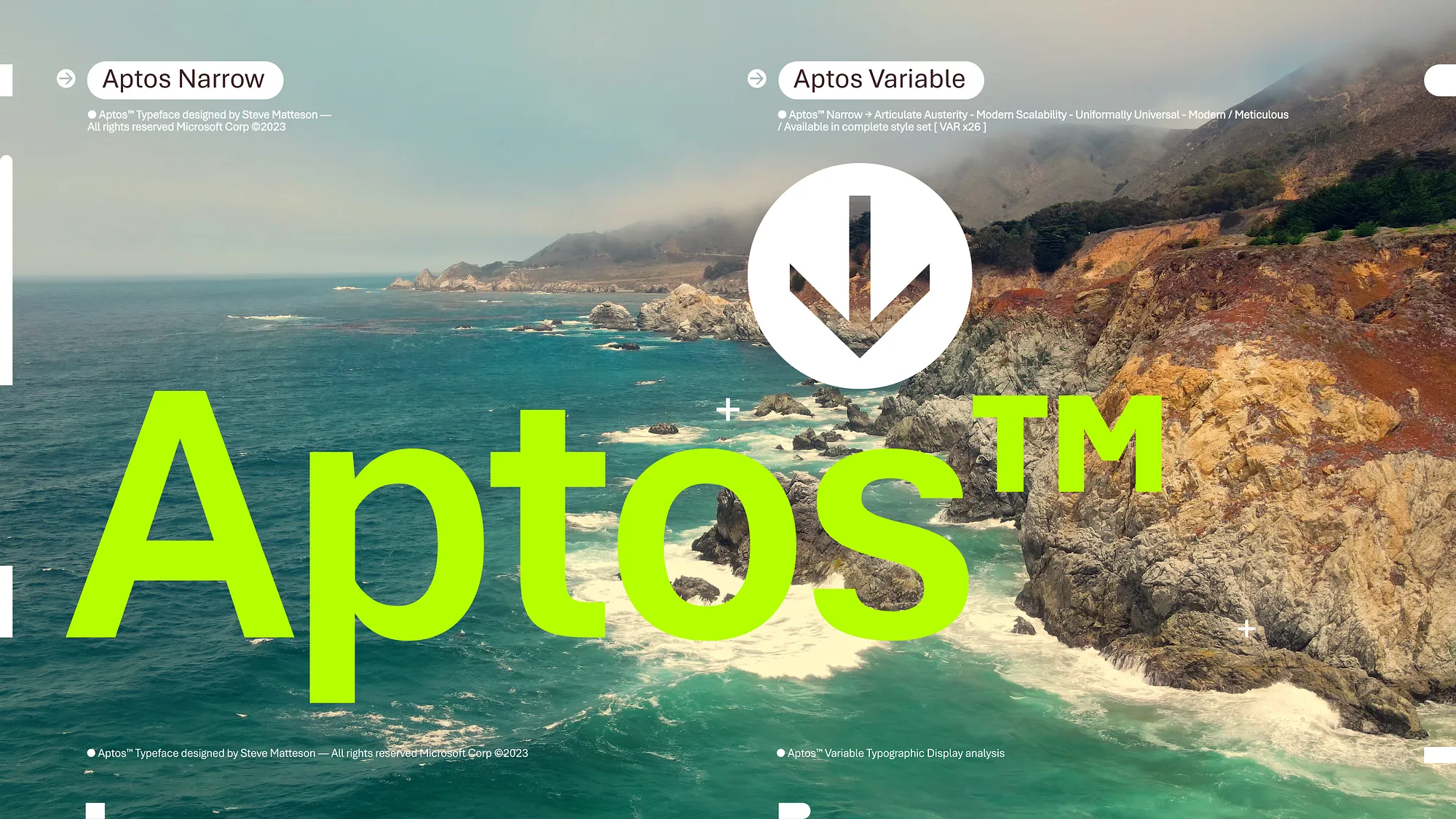
As we shared before, Microsoft commissioned five new fonts: Bierstadt, Grandview, Seaford, Skeena, and Tenorite. It was our hope that one of them would be our next default font for Microsoft 365. All of them were added to the drop-down font picker. From there, as you got a chance to use them, we listened to your impassioned feedback and chose the one that resonated most which was Bierstadt. But as there was a change of guard so too the name. Bierstadt is now known as Aptos.

Today we begin the final phase of this major change where Aptos will start appearing as the new default font across Word, Outlook, PowerPoint and Excel for hundreds of millions of users. And, over the next few months it will roll out to be the default for all our customers. We can’t wait for Aptos to be readily available since it was crafted to embody the many aspects of the human experience.
The typeface was created by Steve Matteson, one of the world’s leading type designers. His previous work includes the development of the original Windows TrueType core fonts and the creation of Segoe. Steve renamed the typeface he designed from Bierstadt to Aptos after his favorite unincorporated town in Santa Cruz, California, whose widely ranging landscape and climate epitomizes the font’s versatility. The fog, beaches, redwood trees, and mountains of Aptos summed up everything that he loved about California. Getting away from digital and evoking the outdoors was akin to getting back to pencil and paper. Drawing letters by hand would play a pivotal role in Steve’s creative process.
He designed the font with a slight humanist touch. He wanted Aptos to have the universal appeal of the late NPR newscaster Carl Kasell and the astute tone of The Late Show host Stephen Colbert. “There’s always that little voice inside of me saying, ‘You know, you gotta try to sneak in a little bit of humanity. You can’t just use rulers and straight edges and French curves (a template used to help draw uniformed curves) to make all these shapes mechanical.’ I did that by adding a little swing to the R and the double stacked g,” he said. Steve wanted the font to be more universal and less mechanical or institutional. Aptos had to induce trust and be engaging to read.

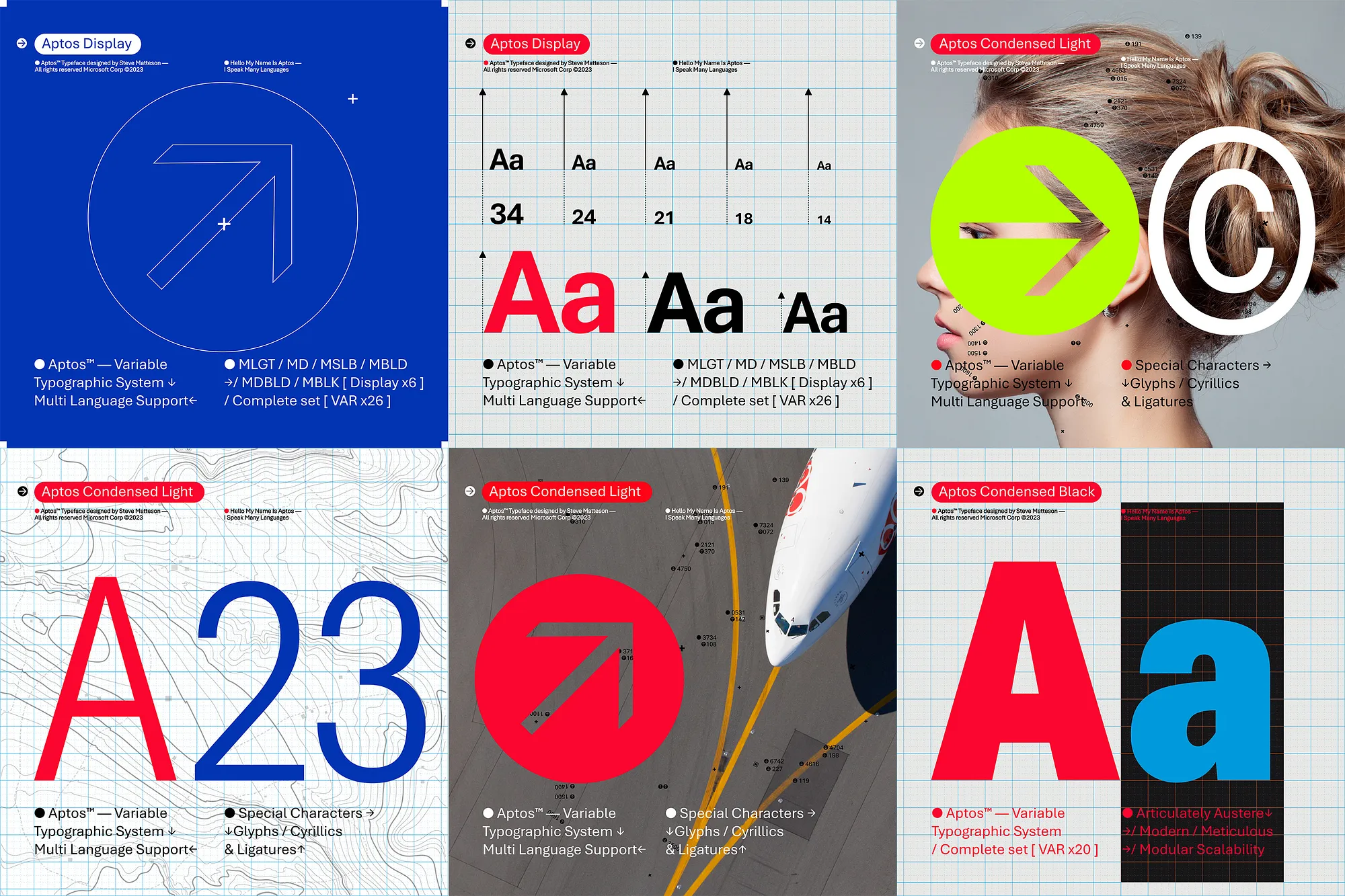
Similar to mid-20th-century Swiss typography, Aptos is a sans serif. Also referred to as Grotesque or Gothic, sans serif often have simple letterforms, even strokes, and they’re easily readable. Aptos, made of varying geometric shapes, is bold, well-defined, directive, and constrained. It articulates many different languages and tones. Stem ends are clean cut. Subtle circular squares within the letters’ contours allow higher legibility, especially at small sizes.
There are different font weights to help set modes and direct the reader’s attention. The new default typeface is professional, and yet relatable. Aptos embodies professionalism, adaptability, subtle flourishes of expression, and more clarity. Now the lowercase l has a distinctive tail, separating it from the capital I. The heads of i’s and j’s are circular dots as opposed to grotesque squares. 6 is single stroked while two piled ellipticals make 8.
Steve said the font has an understated personality that couldn’t be “overtly” neutral. There had to be some warmth. “It’s kind of like listening to a GPS voice versus a human voice. People would rather listen to a human than a robot telling you to turn left, that’s my ethos getting put into the design,” Steve said. His process begins with a pencil and sketch pad. All fonts get ideated through scribbling on paper. To him, working strictly on the computer becomes too “ephemeral” and the why behind the ideas becomes easy to forget.
Drawing letters preserves the handmade craftsmanship of the typeface when it’s finally digitized. “[On the computer] I can refine the details and I draw very quickly on screen, but sometimes there’s nuances that you get on paper that may not occur if you’re clicking, dragging and holding down the shift key. It’s [drawing on paper is] a more physical expression of yourself.” Though as we celebrate Aptos, we still encourage you to go beyond the default.
To all the fans of our other great font contenders, do not fret, all four fonts: Grandview, Seaford, Skeena, and Tenorite are still there. We even have Aptos in there under the Bierstadt name in the drop-down picker for those who just aren’t ready for the font’s new name. Please know that for some of us Beer Town (the English translation of the German word Bierstadt) will forever live in our hearts.
And, just like its predecessors Times New Roman and Arial, Calibri is pre-pinned at the top of the new font menu (web only for now). They are yours to choose. Fonts are personal. We get that. Remember you can always select the font you want to be your default font in settings.
Aptos is a part of a broader wave of features coming to Microsoft 365. We’re pushing to make the software more expressive and inclusive. There’s a newly designed font picker experience, along with new themes, colors, and backgrounds. These updates signify our devotion to those who use M365 the same way a mechanic does a toolbox, or an artist does a paint brush.
For almost five decades it’s been a great honor to serve you and all of your desktop endeavors. Without you, none of this would’ve been possible.
We know you will enjoy the new font and we look forward to your feedback.
Sincerely,
Microsoft